

Spruce Customer Apps
Spruce Services offers on-demand housekeeping, chores, and partner services to residents of select communities across the country.
Created, maintained, and expanded Spruce’s Design System, designing components and variants for iOS, Android, Web and Mobile Web using atomic design principles, Material Design and Human Interface guidelines. Led discovery/design processes using data, analytics, and research and collaborated closely with engineering, product, and marketing to create a multitude of new features and project initiatives across platforms.
The Problem
One of the many company goals at Spruce during 2023, was to increase booking conversion rates. We had many users across the country signing up for the app, but actually getting them to complete their first booking proved to be the challenge. Using Mixpanel, the Product team pulled the drop off rate on each screen in the booking flow. With outdated UI on our onboarding screens and understanding that there may be too many steps needed to create a booking, Product decided to create a shortened booking flow, called the New User Funnel.
The primary goals for the New User Funnel project were to:
Update the outdated onboarding UI with updated images and copy to better reflect the current product and brand.
Increase booking conversion rates by shortening the booking flow and showcasing our most popular service at a discounted price to new users directly after onboarding.
Get users through the booking flow as quickly and seamlessly as possible.


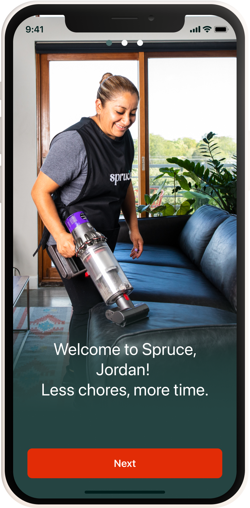
Booking Flow Before - outdated images and copy within onboarding screens. Flow taking six screens before seeing the first service description page.

Booking Flow After - On brand images, updated copy, and a personalized loading screen. Presenting users with a Signature Service that can be booked immediately.
The Outcome
With designs created and hard coded, A/B Testing framework was set up and we began to test this new flow, giving ourselves 4 months to gather data around user engagement. We were able to track that only 27% of new users were booking the Signature Service, while the rest were clicking the ‘Explore Other Services’ CTA upon landing on the service page. While these were not the numbers that we were originally hoping or intending for, this project and test gave us a lot of insight. We gleaned that users wanted and needed more information about Spruce and our offerings. The product team decided to pivot and start working on a personalized home screen experience, unique to our various types of users. Here, we could continue focusing on increasing our booking conversion rate, while providing users with info about the company that would build trust and engagement.
The primary goals for the personalized homescreen project were to:
Curate a personalized user experience for our different sets of users, starting with New, Active, and Lapsed for iOS/Android Apps, and Web/Mobile Web.
Increase booking conversion rates.
Provide first time users with more information on how to create a booking, who Spruce is and who our Service Providers were.
Provide social proof and infographics to build trust and customer satisfaction.
Create streamlined templates/modular cards that could be reused for each user segment.
The previous home screen offered little personalization or detail. Users were not presented with anything other than service categories, leaving no information about upcoming or past bookings, coupons/discounts, or popular services. There’s a lack of social proof or credibility, making users weary about Cleaning Providers entering their homes, especially if they are not home.


Active User w Upcoming Booking
New User
Lapsed User
Active User w Past Booking
The Process
As lead designer, I found it imperative to have the design process from creation to completion be as collaborative as possible. My original designs had each section scroll horizontally, but after working closely with engineering to learn about layout capabilities for Phase 1 and given our short turnaround, we designed each section as a reusable template that can be interchangeable for all users. Marketing helped with updating copy to reflect brand identity and providing current coupons. After leading many stakeholder and engineer reviews, and multiple design iterations, we felt most confident with the designs above. Because of the amount of information and new additions, it felt important to keep the UI as clean and streamlined as possible. New features are - customizable welcome messaging, highlighting any coupons or booking incentives, upcoming bookings, past bookings, rate your service capabilities, ‘Get to know Spruce’, and customer reviews, allowing users to have many options while engaging with the interface.